This is a weird one.
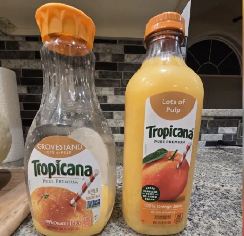
Tropicana, the orange juice people, decided it was time to redesign its carafe-style plastic bottle that it has used for years, replacing it with a more traditional-looking plastic bottle. It also reduced the amount of juice from 52 ounces to 46 ounces, and redesigned the label.
Loyal Tropicana drinkers don’t like the new look of the bottles, and are accusing the company of “shrinkflation.” Tropicana suggests that retailers sell the new 46-ounce version for $3.99, 70 cents less than the carafe, but stores don’t have to comply and many aren’t. Sales of the popular brand crashed shortly after the new containers were unveiled. Tropicana’s sales dropped 8.3% in July from 2023, they dropped 10.9% in August, and by October, Tropicana’s sales had dropped 19%.
The first life and business competence lesson of this fiasco is “If it ain’t broke, don’t fix it.” This is often a bad approach in both life and business, when one should be looking to improve the product (and oneself) always, but there is still wisdom in it. How is the new bottle an improvement other than being different, when there is a loyal customer base happy with the container as it is?
Another lesson is the familiar George Santayana quote, “Those who cannot remember the past are condemned to repeat it.” In 2009, Tropicana replaced its familiar label logo, an orange with a straw sticking out, with a simple glass of orange juice. Customers were outraged. Tropicana’s sales dropped 20% following the redesign, losing the company $30 million. Tropicana brought back the old orange-with-a-straw just six weeks later.
The lesson: orange juice drinkers are creatures of habit. Still, that was only fifteen years ago, and one would think that lesson of orange juice history would be engraved on a plaque somewhere at Tropicana headquarters. Guess not! Even though the logo redesign blunder became a famous case study in business schools, Tropicana did it again. And they changed the orange on the label too!
I must say that I don’t understand this story at all. I can’t imagine boycotting a product I like because it changes its logo or container design. The shrinkflation concern is a valid one, but the bottle? “The carafe was successful in part because customers liked how it looked sitting out at their breakfast tables,” said Peter Clarke, the founder of Product Ventures, a packaging design firm. “The problem with the new one is it doesn’t have any distinctive characters. It’s no longer meaningful. It’s ubiquitous. It’s more of a generic structure.”
Oh no, not a generic orange juice container! Both my mother and my late wife insisted that containers of milk, orange juice and anything else were taboo at the table: you poured it into a glass, and put it back in the fridge. Maybe that’s why this kerfuffle bewilders me.
I prefer Simply Orange to Tropicana anyway.

Just bought a mongo sized bottle of Simply Orange. Everyone seems to be going to taller and narrower bottles. Has to be all about getting the most product onto your allotted/purchased grocery store shelf space. Plus, less wasted space during shipment. People attached to bottle shapes and labels need to get a life. And be grateful for whole orange juice rather than frozen concentrate. Sheesh.
It seems like I remember some story about Irish whiskey. Protestant whiskey was in rectangular bottles (Bushmills) and Catholic whiskey in round bottles (Jameson.). Don’t know if there’s any truth to it, but we micks can be a wee prickly.
You’d think we’d take it in a canteen or a tin can. Not that I can stomach the stuff in any delivery system other than a whiskey sour. “Might as well drink gasoline,” as some character in some Faulkner observes on the subject of whiskey.
The first of my mother’s side of the family arrived in Illinois via Canada as an eleven- or twelve-year-old. His occupation at the time was dram boy on the crews digging the Illinois canal. His job description: give the workers their two drams (ounces) of whiskey per shift.
Ironically, just realized that I am out of orange juice this morning.
I’ve heard that concentrate may actually be fresher, because it preserves the natural color and flavor better. Non-concentrate tends to pale soon after it is squeezed, so dyes and favors are often added to make it look normal.
I don’t care about bottle design either, but I just got up and walked into my kitchen, opened the refrigerator and examined the personal sized bottle that I buy once per week. Sure enough, the 12-oz bottle is now 11-oz and I did not pay any less for it.
:Angryface:
One problem with institutional memory is that top executives in corporate America don’t stay in the same jobs over the long term. The median tenure for a CEO at a S&P 500 company is a little under 5 years. If something happened 15 years ago, it’s likely nobody in the C-suite remembers it.
https://www.thebrandingjournal.com/2015/05/what-to-learn-from-tropicanas-packaging-redesign-failure/
Here I was thinking everyone remembered their previous rebranding failure.
It is not shrinkflation by the manufacturer when the unit cost of the product drops by about 1/2 cents per ounce. A 52 ounce bottle with a suggested price of 4.69 (3.99 +.70) /52 equal $.0901 per ounce compared to .0867 per ounce or 3.99/46.
What is happening is the retailers are keeping the price at that old price while shifting the blame to the maker. Packaging costs are a component of the product and are not typically considered to be part of the value added – although it can be. It is hard to tell whether the issue is the cost per ounce or the new container is driving sales.
Consider the possibility that all manufacturers are trying to reduce their carbon footprint and that while the carafe style bottle my be pretty it requires more petroleum based plastic in its construction. If their marketing departments believe that environmentalism is an important attribute among its customer base then reducing the amount of packaging will not just lower packaging costs it will help reduce the waste stream by the end user.
You cannot blame the execs at Tropicana (Coca Cola) for the fact that retailers don’t provide the product at the new lower price.
I’m…. vaguely on-side with the people who are switching brands. When I bought orange juice, which to be fair wasn’t often because I often skip breakfast, but I used to buy the carafe because it was distinct and looked nice.
Tropicana is a relatively premium product – other juices are cheaper, and orange juice is orange juice, as far as I’m concerned. I was willing to pay the premium because the bottle was different. It’s not that I’m upset that the bottle is different, it’s that they’ve removed what made them unique and I don’t have a reason to pay the premium, so I’ll just buy whatever is cheapest… Which usually isn’t them.
I’m going to stand on my soapbox for a moment and point out that this is another example of the generalized trend of making things look plain. We don’t build things like we used to, whether we’re talking about buildings, furniture, fixtures, street lights, park benches, cars, small appliances, or food packaging, it seems like there’s been a priority set to make things look as bland and minimalist as possible, to remove every possible instance of filigree, and to either build in obsolescence or make them disposable.
I like what you said from your soapbox. I hadn’t thought about it much lately, though my late wife often complained that all car looked the same now, which was and is true. It’s a valid complaint, just one more tiny way that laziness and aversion to risk, plus the pressure to conform, makes like less rich and interesting.
Ah, to see autos with tailfins and two-tone paint jobs again!
If you do a Google search for “park bench” and go to the image tab, you’ll see example after example of beautiful iron trimmed benches with wood struts.
If you go to a park, you’ll see a concrete blob you’re more likely to break your ass on than sit comfortably.
We know what beauty looks like, hell… Google knows what beauty looks like… We just refuse to build it anymore.
That’s a bit unfair. Building an aesthetically pleasing or artistically designed “park benches” that can withstand the elements or misuse or vandalism by the public would be costly. Public benches first attribute must be utility and long life cycle. They also are designed to discourage sleeping
I have one of those pretty metal and wood Victorian benches in my yard and they require a great deal of maintenance to preserve the wood. You have to consider the life cycle costs
The fact is in many ways the EPA’s CAFE regulations create uniformity in design because design impacts fuel economy. Moreover, consumers drive design decisions. Ugly cars don’t sell well. Certain designs are pleasing to the masses so most vehicles gravitate toward the few designs that meet CAFE regulations. Where you see the artistry is in the passenger cabins where everything from heated leather seats to computer screens to satellite telemetry is adding the value and cost.
Building an aesthetically pleasing or artistically designed “park benches” that can withstand the elements or misuse or vandalism by the public would be costly.
Why?
Public benches first attribute must be utility and long life cycle.
Why?
They also are designed to discourage sleeping.
Why?
I’m not necessarily disagreeing with you, but the answer to all of these questions are current circumstances and priorities. We obviously were able to have nice things at one point and time, why not do that again? We are the species that went to the moon, but we can’t figure out a way to have aesthetically pleasing park furniture?
More, you hyperfocused: It doesn’t need to be wood and iron. Plenty of things made of stone or concrete are also beautiful, it wouldn’t be difficult to design and pour a concrete bench with embellishments, if the decision was made to go with the medium.
The decision to make things plain and ugly is, in fact, a decision, that has, in fact, been made.
I blame the communists… In all honesty, I’m finding it difficult to substantiate the claim made in that essay, that the USSR deliberately sought to undermine art in the USA. It’s apparently sourced to a book by Stephen Koch, but I lack the time, money, and energy to buy and read the book and check the sources..
The USSR definitely spent money to undermine all aspects of American society. They sent people and they worked with groups to undermine religion, the nuclear family, etc. It wouldn’t surprise me if they worked to undermine art as well.
To get a product to the market shelf (or frig) it has to be shipped. Eventually all products end up on a truck for some of the trip. Truck load carrying areas are almost universally rectangular, square corners and all that. To get the most cargo in that area the containers need to have straight sides and square corners.
To get the most product into those containers the product should be in some semblance of square or rectangular. If your shipping costs are based on the volume of your package, when your bottles of OJ are shaped like a carafe and the container going on the truck is rectangular, you are paying to ship a lot of air. Fuel costs dictate shipping costs, whether you are shipping OJ or air. At some point this whole shipping thing should enter the equation. Maybe that is where the $0.01 price reduction came from.
On another tack, is the new rectangular OJ container taller than the fancy one, tall enough to not fit in the frig at home?
YMMV