Whatever anyone might think of Ethics Alarms, it can’t be accused of not being eclectic. Today’s Comment of the Day illustrates the point, with an impressive and informative debut by new commenter Dave on the cost savings to be had based on choice of printing fonts, and more. The original post used a sixth-graders science project conclusion that our federal and state governments could save hundreds of millions of dollars by simply conserving ink as a departure point for a general critique of government diligence, responsibility, and competence.
Here is his exposition, inspired by the post, Ethics Rant: Here Is The Smoking Gun Proof That The Government Doesn’t Care How Much Money It Wastes, Or, In The Alternative, That It Isn’t Run By Sufficiently Competent People To Be Trusted To Spend What It Does:
The most important aspect of the 14 year old’s study is valid. You can save money with a better font. How you get there is not important. So I support the hypothesis of the study. Of course, as in almost all studies, it requires more study. Adding paper to the mix makes it more hopeful.
I like his study for three reasons:
1. It puts ink and paper into the public discussion
2. It illustrates that really large numbers times really small numbers equals a big number.
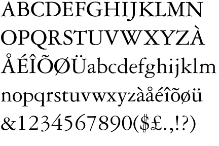
3. It moves us ahead in our quest to the use of something other than Times New Roman. It’s a newspaper font!First off, names are useless in discussing typefaces as they were trashed by the patent/copyright office many years ago. Garamond is one of dozens of great type families. Each has it’s unique features but most do not perform optimally in all applications. The criticism of using Garamond in the testing misses the point entirely. Successfully curtailing the weight of an optimized font, versus a newspaper font, to image on bond paper is likely. Let’s move on from nitpicking Garamond.
Ink is measured in dimes with inkjet, nickels with toner and pennies with printer’s ink. Breaking down the imaging techniques of all government documents is a massive effort, census like. But, for now, let’s address word processed documents. This is probably the largest population of original documents. (We’re not going to make much headway in savings attacking the professional typeset material that is printed in the millions.)
Given we tune a font for ink/toner use, one of the last considerations influencing legibility and readability of a word processed document is typeface. Because MS Word is used exhaustively for this application, I would order the priorities leading to better legibility and readability as follows:
1. Word Spacing. You can see in the example used to trash the study (3rd line of Garamond) It’s like talking to someone who says “uh” every other word.
2. Serifs v. Sans Serif. This choice is more of a readability thing than a legibility thing. I choose sans-serif for heads (eliminating the need for bold italic serif fonts) and serif for text when I create a typical Word doc. Generally, type really doesn’t have to be serif if the document is short but the longer it gets….
3. Line Measure. This goes together with word spacing, the longer the measure the worse word spacing becomes with MS Word. And personally I have attention issues so I need a break more often.
4. Body leading. Otherwise known as line spacing in the world of glorified type writers; it’s like word spacing only in the vertical direction.
5. Letter-spacing. This is font design dependent but not typeface dependent. They can screw this up no matter how the the letters look. It’s one of MS Times New Roman most nasty offenses. It’s not only looks awful, it wastes paper.
6. Hyphenation and Justification (H&J). Justified type is lined up on both sides of the page. Word Processors are not good at this, MS is particularly bad at both H&J. It’s an old requirement with setting type, but it helps readability with long documents. It generally saves paper to boot but it’s not worth botching up word spacing to get these advantages. (It’s not as critical with 1-2 page documents so that’s why it’s 6th on the list.)
7. Type Style. If we excel at all of the above, like professional design software, then the particular type design is a factor. Because we are focused on text, the theory is if we significantly adjust the design for 12 point and with word processing in mind we can do well here in ink savings.
8. Paper color. Office paper is very good here.
9. Type color. Anything other than black type can’t be discussed here but it is realistic to discuss grey. I exclusively use draft mode on my inkjet printer and nobody notices.
10 . Room light. Using serifs or not and setting an appropriate type size is about wearing out your eyes with too little or too much light. Serifs on text cut back on light, while size impacts detail helping legibility. Sans serif type in headlines are not an issue because they are short and it provides contrast with the text.
So, the student’s focus on the smaller, most used type is appropriate. The focus on weight relative to ink usage is also appropriate. A focus on more sophisticated typography than MS offers today would significantly impact paper usage, even without using two sided features we have today.
TrueType, GX stuff, et al were all awesome in 1996, a big accomplishment. They are still relevant for designers, but here we are stuck with MS Word; Opentype features are wasted. Moving to a maybe more primitive technology but optimized for both savings and readability would be a good start towards the $400 million goal.
We are in a transition period, so it may be awhile. Saving money along the way to fully electronic isn’t a bad thing. These no valid reason to make trade offs during the transition. It will be complicated but in step with the transition. All ideas are worthwhile, there is no reason not to implement all of them.