Good morning!
1. Another “growing crisis” to fear: Rorschach innuendo that people can interpret to confirm their own biases... Deposed Secretary of State Rex Tillerson told graduates in his commencement address at the Virginia Military Institute in Lexington, Virginia, that American democracy was threatened by a growing “crisis of ethics and integrity”:
“If our leaders seek to conceal the truth, or we as people become accepting of alternative realities that are no longer grounded in facts, then we as American citizens are on a pathway to relinquishing our freedom. When we as people, a free people, go wobbly on the truth even on what may seem the most trivial matters, we go wobbly on America.”
Verdict: True.
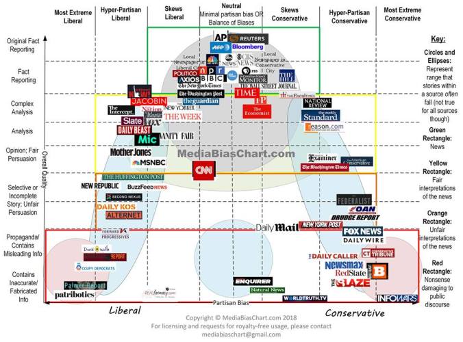
The New York Times, without hesitation, calls Tillerson’s remarks a “veiled rebuke” of President Trump, and “veiled” doesn’t even make it into the headline.
Why isn’t this just as much of a “veiled rebuke” of Hillary Clinton, Bill Clinton, Barack Obama (“If you like your plan…”), James Comey, Andrew Cuomo, Elizabeth Warren (I’d say her continuing Native American lie is a perfect example of a trivial matter that matters), Chris Christie, Senator Mitch McConnell, Harry Reid, Rep. Nancy Pelosi ( The U.S. Supreme Court is “five guys who start determining what contraceptions are legal.”, “I don’t know who (Jonathan Gruber) is,” “In the first year of the Obama administration, more jobs were created in the private sector than in the eight years of the Bush administration.”…and so on, and on…), Newt Gingrich, Senator Richard Blumenthal, new head of the NRA Oliver North, and many, many others in both parties?
You know why: the media’s agenda is focused only on denigrating Trump. As for Tillerson, his statement is consistent with what The Ethics Scoreboard and Ethics Alarms have been trying to explain for nearly two decades now, with one major, ethical difference: I don’t use weasel words and innuendo, and Tillerson did. If the ex-Secretary of State has a whistle to blow, let him blow it, and not litter the scene with whistles so anyone can blow them to their own ends. Statements like his are worthless without specifics, and merely arm partisans, hacks and character assassins.
I also don’t accept ethics lectures from oil company executives. I’m funny that way.
2. And speaking of a crisis of ethics and integrity…and trustworthiness…Here is the New York Times correction yesterday on a story attacking a piece on Foundation for Defense of Democracies chief executive Mark Dubowitz:
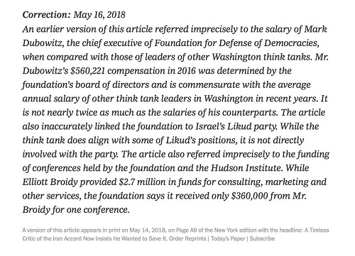
I don’t know what the maximum number of errors in a single story is that can be corrected before a responsible reader has to say, “The hell with this rag; I’m going back to the Weekly Reader!”, but whatever the limit is, this easily exceeds it. The New Yorker used to publish such corrections as humor, except the excerpt would be from The Hooterville Register, not the New York Times. Don’t you love the equivocal “referred inaccurately” weasel words? Saying that a salary that is actually in line with similar salaries in the field is twice such salaries isn’t “inaccurate,” it is a gross and inexcusable mistake.
Gee, I wonder if Rex was rebuking the leading news media…. Continue reading →