Can you believe this?
What is this, a “Count the stereotypes” puzzle?
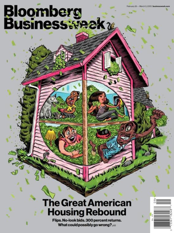
How could this manifestly, incontrovertibly, racially offensive cover get the green light for any professional publication in 21st Century America? I am aghast.
It gets worse. Here is the apology issued by the Josh Tyrangiel, the magazine’s editor:
“Our cover illustration last week got strong reactions, which we regret. Our intention was not to incite or offend. If we had to do it over again we’d do it differently.”
Your Ethics Quiz Question for the day:
How do you rank this on the Ethics Alarms Apology Scale, and why?
You can check the scale here.
I’m too aghast to write anything else.
Good night.

11. Not an apology at all, but an insulting play on words.
Yes, I think I’m with you. It’s not an apology at all. It doesn’t say “sorry, ” its says, “Tough! But since we don’t like getting stuff thrown at us, we wish we had done this differently.”
Personally, I’d just say- if the shoe fits, wear it.
It is almost between 9 and 10 on the scale.
“I’m sorry that you feel that way” is what I take away from it.
I would give it a 6. Bloomberg seems to have rather lax standards about this sort of behavior. Based on what happened this week, I think the perpetrators would have been executed if they had worked for NASCAR.
Sort of? I just assumed that the editors must be legally blind. I’ve pretty much decided this is an 11—not an apology at all.
This is a non-apology. It barely could be confused for one by inclusion of the word “regret”. But they didn’t attach that “regret” to the offensive image they published, they attached it to receving angry responses to the image.
That’s equivalent of saying “I regretted stubbing my toe last night night”
On the flip side: it is safe to assume this image would have garnered equal criticism had it portrayed buck-toothed glasses-wearing WW2 propagandist style Asians, it would have garnered criticism for showing big figure-6 shaped noses and yamulke’s and hand-rubbing Jews:
would this image have garnered any criticism if it had portrayed bloated plutocratic white people or wiry bible-thumping hicks?
I assumed they weren’t blind, but that they didn’t look at it at all. No one who knew that average Americans would see this would publish it, so I assume that the editors aren’t doing their job and when it came out they issued an apology. I am waiting to see if the artist who created this gets fired. I just can’t believe that the editor actually looked at and approved that cover, so I am saying a 6 based on incompetence. If they really thought that was funny, or worse, appropriate, that I am at a loss. I just can’t process it.
Yes, that says it for me. I can’t process it. I can’t imagine this kind of thing getting through any editing process. But I wouldn’t punish the artist–in fact, it almost looks like a conspiracy to GET the artist fired. He/she should be able to trust editors whose job it is to filter creative efforts to ding something so obvious inflammatory. This is editing incompetence of the first water.
I heartily agree that Tyrangiel went onto the Spinal Tap scale and took this one right to eleven. Your criteria for a nine is that it be a statement “crafted to look like an apology when it isn’t.” This is not that. If anything, I’d say that what Tyrangiel offered was a statement that deliberately avoids looking like an apology, but in a way that strives to maybe encourage some people to misconstrue it as an apology. I’m almost impressed.