Oh, I almost forgot….
Kaboom!*
If this can save millions, what other measures are out there? Never mind—if they couldn’t find this, they won’t find them, either.
Here is the news story that justifies the title, and also that made my dome blow, as I’m sure yours will.
A 14-year old sixth grade student from Pittsburgh named Suvir Mirchandani devised, as his science fair entry at Dorseyville Middle School, a computer project that examined printing costs. He analyzed a random sample of school printouts and measured how much ink various fonts use. Noting studies that found ink remarkably expensive (I thought it was just my printer), Mirchandani calculated that by simply switching from the Times New Roman font to a thinner, more ink-thrifty font like Garamond, his school district alone could reduce its annual ink costs by 24%, saving up to $21,000 annually.
His teacher encouraged him to submit his work to the Harvard-based Journal for Emerging Investigators, who were moved to inquire, “How much money could the government save if it switched to Garamond?”
Plugging in the Government Services Administration’s estimated annual cost of ink, Suvir concluded that if the federal government used Garamond exclusively it could save nearly 30% of the total $467 million, or $136 million per year. Placing state governments on a font diet would save an additional $234 million, he reported.
They checked his figures, and he was right. The simple act of changing a typeface would save taxpayers $400,000,000 a year. Kaboom.
Now permit me a brief rant…
A sixth grader figured this out. Not the GAO. Not the GSA. Not a government economist or a comptroller. Not a Congressman or high-paid bureaucrat. A kid. You do know what this proves, don’t you?
Nobody in our vast, soul-killing, money-eating, freedom-squashing, blundering, stumbling, bumbling, arrogant, corrupt network of knaves, fools, enablers, cronies, hacks and hangers-on we call our government, at least none with two brain-cells to rub together and a genuine sense of public duty, ever bothered to devote a good couple of days to seriously examining how the public sector could easily, painlessly, quietly reduce expenses so the money could be spent productively, applied against the debt, or better yet, returned to the people who originally earned it.
How do I know that? I know that because nobody ever looked at the huge sums of money our government spends on ink and as a result thought, “Wow! That’s a lot of ink! I wonder how we could use less of it?” IF someone asked that question; IF there were honest, dedicated, fair people in government posts who recognized that their very existence take money out of our pockets and they damn well better justify it, then the thought “Hey! I bet we could use a thinner font!” would have surely occurred to somebody. But it didn’t, so we know that either…
1. Nobody was smart enough to make the connection a precocious sixth grader did, or
2. Nobody gives a damn, at least nobody with the authority to do anything.
There is no third choice.
This explains a lot, indeed, everything. It explains Presidential vacations, and IRS Star Trek parodies, and our top Justice Department official exploiting loopholes to take personal trips costing millions. It explains why the tiny sliver of the Federal budget affected by the sequester caused so much pain and suffering, why Healthcare.gov still doesn’t work right, why nobody can stop agencies from growing, why there are so many redundant programs sucking up money, why all the projections are always wrong, or lies, or misleading, or hiding something, why government procurement is so expensive, why Secret Service agents get drunk on the job and why America can’t be a force for good in the world, which really, really needs one. It explains why our very form of government, truly a beacon of hope for civilization, has lost the trust of its own citizens. It explains the lies, and the fraud, and the constant misinformation spewed into the atmosphere like sulfurous smoke by villains like Nancy Pelosi, incompetents like Kathleen Sibelius, and toadies like Jay Carney. It explains why the American Eagle is bleeding red ink, and has become an object of derision and ridicule abroad.
You want to know why we balk at paying pensions for government employees? This is why. Because you couldn’t or wouldn’t figure out that you could save money by using a thinner type face. You’re a disgrace.
The leaders, high officials, bureaucrats and employees government, and its companions in the states, aren’t remotely smart or diligent enough to do all the tasks they have convinced lazy, inattentive, state-teat-addicted citizens that they can and should handle. The government doesn’t try to save money, or conserve it, or spend it wisely, or when and if it does try, those responsible are too dumb, careless, distracted or unmotivated do it properly. So thousands, millions of ways to save money, many as simple as just using a different type font, never get considered, because nobody with a brain or a conscience is thinking about it. This goes on for years and decades, while Republicans argue that costs have to be cut with a meat-axe even if desperate people are hurt, and Democrats wail that government is wonderful, it’s just that it needs more feeding.
It doesn’t need more feeding. It needs more dedicated employees with the initiative and smarts of a sixth grader, leaders who know how to manage projects and resources competently, reporters who objectively show us when the leaders are corrupt or stupid, and voters who throw them out when they don’t. We have none of those things now.
Oh—informed of Mirchandani’s discovery, the Government Printing Office politely told CNN that “the GPO’s efforts to become more environmentally sustainable were focused on shifting content to the Web,” and no change in official font was likely in the hear future.
Of course not.
Kaboom.
* Note: A “Kaboom!” is the special Ethics Alarms designation reserved for news stories revealing ethical misconduct so shocking that it causes my head to explode.
____________________________

Thanks for doing that rant for me. I feel better now.
Wow, if our 6th graders can solve problems like that now, imagine what they could do if we just blindly threw more wads of money at our public school systems!
Rants aside, the story is a rich source of irony…
The real “kaboom” would be when we got the bill for the study concluding that switching fonts would save money…
Of course, does the government exclusively use thick fonts?
That’s what I was thinking. I have seen a variety of fonts used in the government, I guess depending on agency directives and/or nods to readability. So they would first have to determine how ingrained is the practice of thick fonts, whether it would really save money, and if it does, carve out exceptions when thick fonts should be used. While they are at it, they could also try moving away from paper period as much as possible. In this day and age, electronic paper trails seem the better way to go anyway.
I checked a variety of printed government publications, and Times Roman is indeed the norm in all the text. Are there exceptions? Who cares? Why is your first response always to rush to the government’s defense? If the government spends one penny more than necessary on ink, it’s negligence and waste.
I was thinking internal government printing, not formal government printing. For formal printing publications, Times New Roman (and Courier to a much lesser extent) is pretty much the standard everywhere, due to its ease and readability. The suggested substitute seems like it would be fine on some more casual occasions, but might cause some eye strain for longer works. Just some practical thoughts as to why that hasn’t been implemented everywhere.
The underlying disease that infects every bureaucracy and every other socialistic themed movement or group is the lack of personal initiative. There is no incentive to cut costs when one is granted huge sums of other people’s money, no matter how mediocre, unnecessary or illicit their mission might be.
Thick heads, thick fonts. A true “no-brainer.”
Ohhh, if only Reagan or Harry Truman (who was notoriously thrifty) was President today then maybe somebody would get their behind whacked good to “motivate them.”
1. Who prints anymore? I am serious when I ask that question — everyone under the age of 50 rarely uses a printer. I type all day long on my computer but I only need to replace my ink cartridges 1-2x a year. So, the real question is why any corporation, school district, agency, etc. spending so much on ink. The first step is to take away the printers! Then you’ll save even more money.
2. You are wading into the messy area of procurement. No agency has an “ink” budget, rather — each department within a department within an agency has a set amount that it spends on overall office supplies. So, it is not surprising to me at all that this study was never done.
3. The bigger problem that these agencies have is a “big data” problem. Your head is going kaboom over ink? You should check and see what agencies are spending to store and manage big data.
4. My old law firm forced me to write all legal memoranda, briefs, etc. in Garamond. I hate that font — but perhaps it’s the association.
So explain to me how someone can simultaneously argue thatthe government is too big to focus on simple economies, and yet isn’t too big to do its job period. Makes no sense. One follows the other.
To answer your question, our governments still print literally tons and tons of reports, forms, applications, statute books, regulations, pamphlets, brochures and other crap. Tons.
They shouldn’t be printing as much — no one should.
Your rant above applies to any corporation, big or small. Here’s an example that happened to “a friend” recently. She works remotely and her laptop completely died. Since her company had the ability to repair it, she had to use them to fix her computer. She also was required to ship her computer a certain way (overnight, with insurance) that costs about $500. The computer was then fixed and shipped back to her at the same rate. So, this transaction cost around $1000 — before you add in the cost for labor. She suggested instead that her company simply purchase a new laptop — which would have cost UNDER $1000. And, the bonus would be that she would have a new computer that theoretically would need less repair. The response? Shipping expenses and hardware expenses fall under different budgets so that couldn’t be approved. Kaboom.
Corporations are held accountable, Beth, and those running annual deficits reorganize, fire people, and declare bankruptcy. There are incentives to fix such problems. Not in the government.
In my experience, this does NOT hold true at all with large corporations. Too many committees and silos. And many corporations are not publicly owned. Obviously, a small corporation analyzes these things more closely.
I agree that there are badly managed corporations. They can get too big to manage efficiently too.
They asked an actual typographer about this experiment, and he basically thinks it’s crap. http://www.thomasphinney.com/2014/03/saving-400m-font/
He had several problems with the findings, all of which make sense.
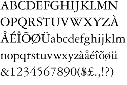
1. Basically the chosen font, Garamond, is a smaller font than Times New Roman, so of course it would save on ink…because it is a smaller font. He says that you could probably realize the same amount of savings simply by setting Times New Roman in a smaller size as well (say 10 point font, rather than 12 point). People don’t do that, because it causes readability issues, which would be the same readability issues that Garamond would have.
2. Most government offices have maintenance contracts, and the cost of toner is not separated out. Most of the cost is calculated more by pages printed, so to save money, people would have to use a smaller font, not a lighter one, but once again, readability issues.
2b. For large print jobs, jobs are contracted out to third parties. Those bids take into account amount of pictures/graphics, etc,, not straight up ink costs. So no savings there.
3. Technical issues with Garamond. Apparently it does not allow the use of bold italics in Word?
Per usual, it seems like the media did not bother to let the facts get in the way of a good story. Your head can unexplode now.
So you are saying, seriously, that there is NO WAY to save scarce federal funds on an expensive item like ink, based on the fact that a typographer decided to nit-pick the details (the irrelevant details, incidentalyy) of a simpel cost-saving measure that is irrefutable and woulkd have occurred to anyone meeting their public duty to conserve tax payer funds and minimize public debt. Screw Garamond…the post and the news reports use Garamond as an example only. Here, I’ll make it easier for you:
USE LESS INK!!!!!!!!!!!!
Print less junk, write fewer words, use smaller type and thinner type fonts, negotiate down price, act like a 900,000,000 buck ink cost matters, rather than shrugging it off as a drop of ink in the bucket. That’s the point, and the mindset is inexcusable. And it is enabled by those who, like you, rush to muddy the water and the message by obscuring the principle with nitpicking. You really do worship a Statist shrine, despite clear evidence of waste, arrogance and stupidity, and literally can’t handle the truth.
But thanks for the trivia.
“Scarce federal funds”?
Jack, don’t you realize there’s no such thing as “scarce” federal funds… My great grandchildren have tons of funds they aren’t using right now that we can spend!
Nitpicking? The entire premise of the original article, and this post as well, was that by making this one simple change (switching from Times New Roman to Garamond), the government would save an enormous amount of money, and it was inexcusable that the government didn’t do that.
As it turns out, there are very valid reasons why the government hasn’t done that, the most important of which boil down to readability issues. What is the point of printing out stuff if most people would have a hard time reading it? If readability is not a factor, then yes, just print out everything in one point font. We would save enormous amounts in both ink and paper costs!
Some of your suggestions above, like printing less in total and negotiating down prices, the government already strives to do. More and more things are available online, which helps reduce printing costs. But the population least likely to do things online, the older population, actually needs readability the most. So using smaller fonts actually adversely impacts what the government would be trying to do in this case. And I will also reiterate what was said in the critiquing article, using less ink won’t have much, if any impact on the bottom line anyway, because the government typically isn’t charged for ink, but pages printed instead as part of their maintenance contracts. So no need for hand wringing about government waste in this case, because it doesn’t appear to be an issue.
I don’t rush to be outraged, nor do I cling to outrage in the face of contrary facts. It turns out this study doesn’t pan out, for many valid reasons. It isn’t “trivia” to point out that the entire foundation that the premise was flawed. Facts do matter. And if it is too good to be true, a person should definitely be at least a little skeptical.
No, that was NOT the premise. The premise was that this was one small illustration of the far more expansive problem.
The study does “pan out.” Smaller, thinner font, less money, big savings.
Just for starters, you most certainly can use bold italics in Word with Garamond. It took me about 20 seconds to check.
Second, I don’t think that anyone thought that the 6th grader had worked out every possible angle on this. Of course it might not be as simple as “Switch to Garamond-” we don’t even know if that’s the most efficient font, just that it’s the one he looked at. The point is that this is one of those brilliantly obvious things that nobody thinks of, and the response to it was “eh, who cares?”
Hell, it might not be 400 million, but how much would the fed save by setting their default font to a sans serif font? Times New Roman (and Garamond, for that matter) are using extra ink so the ends of the lines look fancy. But, God forbid that an ordinary citizen point out something the mighty government missed, so it will never get a moment’s consideration beyond the time it takes to say “no.”
Bingo, Luke. Exactly.
My point was it is not “one of those obviously brilliant things that no one has looked at.” The boy basically came up with, “hey if you want to save on some ink, use a smaller font.” Which, duh. It’s a good conclusion for a sixth grade science project, but hardly brilliant. I think the inclusion of a different,and smaller font confuses people, but basically all he is saying is that using the visual equivalent of a ten point font will use less ink than a twelve point font. All this means is that people will increase the font size so they can actually read it, and there goes your savings.
There might be other fonts out there that save on ink without sacrificing readability. But this ain’t it. The whole premise that the government is wasting money by refusing to implement this one “simple solution” is false. Any more solutions would probably require a study (if it hasn’t already been done. We have no clue.) and I know how some people on here feel about that.
Who said it was brilliant? The whole point is that it isn’t brilliant. It’s obvious. And any organization spending significant amounts of other people’s money that could be saved by making the observation is obligated to do so, while any such organization that does not is, by definition, incompetent, wasteful, irresponsible, arrogant, and/or too dumb to be trusted. That’s all.
My point is, again, that obvious observation is not really all that valid. If you don’t take readability into account, and your only concern is just ink savings, then yes, those suggestions are both simple and great. Not just great, it should be criminal that someone didn’t think of it before! …But of course, the whole point in printing something is that someone will read it. So some nods have to be made to readability, otherwise the government could print everything in white and get rid of the whole ink budget altogether.
I think everyone knows that printing something smaller will save on money and paper. But if it sacrifices readability for both audience and author, then what should the trade-off be? Switching to lighter and/or skinnier fonts might be something the government would want to do. But it is hardly a “pain-free” solution, as was suggested from this post. And there are perfectly valid reasons on the other side as to why the government may not want to do that. That doesn’t make it ” incompetent, wasteful, irresponsible, arrogant, and/or too dumb to be trusted.” It may come from a very thoughtful place, where a bunch of competing interests in readability, saving ink and/or paper, monitor light output, ease of use, and compatibility all have to be considered and weighed. And the answers would no doubt be different depending on the different agency in question. I have no idea if this has already been looked at or not. Nor, I would think, do you. That is all.
It’s really not the equivalent of a 10 point font. The characters are just as large. The lines are thinner. Bring up both from the fonts control panel in windows. I actually find Garamond more readable. The extra white space helps keep the characters visible separate.
Garamond does lack a defined bold italic, but Word is capable of extrapolating from what it has in some fashion.
If I recall correctly, Times New Roman used to be the default in word. That may have something to do with it.
Garamond is a bit shorter, but that’s not the same as scaling down the point size.
I think the typographer in the article I cited said it’s about 15% smaller, which I think would make it somewhere between at 10 and 11 point font equivalent.
But the fonts are shaped differently as well- Times New Roman has large serifs and is taller than it is wide, so sizing it down decreases readability. Garamond is squarer, so it scales differently. You could make a font that was incredibly tall and skinny or short and wide that was “bigger” than TNR (each character taking up more pixels than its TNR equivalent) that was totally unreadable, too.
Taken from the link above:
Setting any font 15% smaller would save 28% of its area coverage. Of course, there are some caps in the texts as well, which would make the savings a bit less. Interestingly, this is pretty exactly much what the study found. So, you could just as easily save ink by setting the same font at a smaller point size.
For a moment though, let us pretend that the study did in fact equalize the x-height, and found that a typeface change saved ink. That would most likely mean that the strokes making up the font were just thinner at the same size (“stroke” is a virtual thing here; modern digital fonts essentially trace the outlines of the letter). If that were good and useful, why not go further? Why not make the strokes even thinner? Maybe there is no font bundled with common operating systems and software that would meet these needs, but one could just commission one. Even a master type designer could do a basic four-member family for $100K or so, which is a lot less than the hundreds of millions at stake.
But any of those changes, swapping to a font that sets smaller at the same nominal point size, or actually reducing the point size, or picking a thinner typeface, will result in slightly less legible text. That seems like a bad idea, as the % of Americans with poor eyesight is skyrocketing as our baby boomers (and even their children, like me) age.
It’s mostly typography speak to me, but it looks like he does address that.
I agree he addressed it, I just don’t think he’s coming to correct conclusions based on his facts. TNR really isn’t all that great of a font, it scales down poorly and has serifs (sans serif all the way, woo!) Yes, reducing the stroke thickness has some incremental decrease on a typeface’s legibility- but if you use a font designed for easier legibility, it balances with factors like thinner strokes while saving on ink cost.
You are all wrong. Papyrus is the way to go.
I’m not a typographer, so I have no clue. But obviously reasonable, informed people can come to different conclusions as far as that goes. Coming down on different sides of ink savings vs. readability doesn’t make it an ethics fail, is the entirety of my point.
That means a massive importation from Egypt, Tex. Maybe we can trade for them with more Abrams tanks and F-16s. After all, we’re pretty well shutting down the Armed Forces!
SMP….
the Font Papyrus… the Font…
The only thing we need from Egypt is for it to get over this recent pipe dream they’ve had and settle back into a relatively* benign military soft-dictatorship. The only system that nation seems most optimally comfortable with.
Ohhhh! THAT papyrus! Silly me!
I think it’s obvious that Comic Sans is the way to go. It would reflect the level of regard I take for most governmental proceedings. Or we could do Wingdings, it couldn’t do any harm to the existing ability to understand their publications. Or possibly Jokerman, to give that wacky and fun feeling.
Who didn’t know that a smaller font equaled less ink and more space? As the typographer says, if that’s the issue, then just set Times New Roman at a smaller font size, and voila! But there are very valid reasons why people prefer reading in 12 point font, and not 10 point (or smaller). I thought the whole point was using Garamond promised savings without also sacrificing readability, a painless switch, but that doesn’t appear to be the case. You are trading readability for savings, which might be ok, but hardly worthy of a sexy headline like I’ve seen trumpeted these least few days across the internet. I assumed that everyone already implicitly knows that you can sacrifice readability to save on space and/or ink.
At this point, the basic take-away is that the government can save money by using Times New Roman at 10 font. Which all seems…very anti-climatic somehow, and hardly rant worthy.
“Who didn’t know that a smaller font equaled less ink and more space?”
Anyone who has lived with the ubiquity of printed words their WHOLE lives. It’s an easy thing to take for granted and simply overlook.
The issue raised is not that they missed it given the ubiquity… but that they missed the savings because they don’t think with a stringent and exacting fiscally responsible culture. That may or may not be valid.
I have actually seen internet discussion boards where arguments over Fonts have become as impassioned and emotional as Barry or TGT’s blindly faithful adherence to illogic.
Thank goodness this discussion has remained civil.
Oh God yes, you didn’t know that was a thing? I remember the great Arial vs Helvetica wars of ’08.
The 14 year old was not the first to uncover this. He simply had a nifty science project. A 2011 article regarding excessive printing:
http://fcw.com/Articles/2011/10/24/COMMENT-Brian-Henderson-how-to-cut-printing-costs.aspx?Page=2
That the idea is not completely original is not particularly relevant. The existence of an even older article, however, supports Jack’s notion of bureaucratic waste and inertia for not implementing leaner printing standards sooner.
I do share some of Deery’s concern that merely cutting ink costs by changing fonts could have unintended consequences, but agree with the notion that the government needs to look at savings in all areas, including **eliminating** unnecessary printing.
The most important aspect of the 14 year old’s study is valid. You can save money with a better font. How you get there is not important. So I support the hypothesis of the study. Of course, as in almost all studies, it requires more study. Adding paper to the mix makes it more hopeful.
I like his study for three reasons:
1. It puts ink and paper into the public discussion
2. It illustrates that really large numbers times really small numbers equals a big number.
3. It moves us ahead in our quest to the use of something other than Times New Roman. It’s a newspaper font!
First off, names are useless in discussing typefaces as they were trashed by the patent/copyright office many years ago. Garamond is one of dozens of great type families. Each has it’s unique features but most do not perform optimally in all applications. The criticism of using Garamond in the testing misses the point entirely. Successfully curtailing the weight of an optimized font, versus a newspaper font, to image on bond paper is likely. Let’s move on from nitpicking Garamond.
Ink is measured in dimes with inkjet, nickels with toner and pennies with printer’s ink. Breaking down the imaging techniques of all government documents is a massive effort, census like. But, for now, let’s address word processed documents. This is probably the largest population of original documents. (We’re not going to make much headway in savings attacking the professional typeset material that is printed in the millions.)
Given we tune a font for ink/toner use, one of the last considerations influencing legibility and readability of a word processed document is typeface. Because MS Word is used exhaustively for this application, I would order the priorities leading to better legibility and readability as follows:
1. Word Spacing. You can see in the example used to trash the study (3rd line of Garamond) it’s like talking to someone who says “uh” every other word.
2. Serifs v. Sans Serif. This choice is more of a readability thing than a legibility thing. I choose sans-serif for heads (eliminating the need for bold italic serif fonts) and serif for text when I create a typical Word doc. Generally, type really doesn’t have to be serif if the document is short but the longer it gets….
3. Line Measure. This goes together with word spacing, the longer the measure the worse word spacing becomes with MS Word. And personally I have attention issues so I need a break more often.
4. Body leading. Otherwise known as line spacing in the world of glorified type writers; it’s like word spacing only in the vertical direction.
5. Letter-spacing. This is font design dependent but not typeface dependent. They can screw this up no matter how the the letters look. It’s one of MS Times New Roman most nasty offenses. It’s not only looks awful, it wastes paper.
6. Hyphenation and Justification (H&J). Justified type is lined up on both sides of the page. Word Processors are not good at this, MS is particularly bad at both H&J. It’s an old requirement with setting type, but it helps readability with long documents. It generally saves paper to boot but it’s not worth botching up word spacing to get these advantages. (It’s not as critical with 1-2 page documents so that’s why it’s 6th on the list.)
7. Type Style. If we excel at all of the above, like professional design software, then the particular type design is a factor. Because we are focused on text, the theory is if we significantly adjust the design for 12 point and with word processing in mind we can do well here in ink savings.
8. Paper color. Office paper is very good here.
9. Type color. Anything other than black type can’t be discussed here but it is realistic to discuss grey. I exclusively use draft mode on my inkjet printer and nobody notices.
10 . Room light. Using serifs or not and setting an appropriate type size is about wearing out your eyes with too little or too much light. Serifs on text cut back on light, while size impacts detail helping legibility. Sans serif type in headlines are not an issue because they are short and it provides contrast with the text.
So, the student’s focus on the smaller, most used type is appropriate. The focus on weight relative to ink usage is also appropriate. A focus on more sophisticated typography than MS offers today would significantly impact paper usage, even without using two sided features we have today.
TrueType, GX stuff, et al were all awesome in 1996, a big accomplishment. They are still relevant for designers, but here we are stuck with MS Word; Opentype features are wasted. Moving to a maybe more primitive technology but optimized for both savings and readability would be a good start towards the $400 million goal.
We are in a transition period, so it may be awhile. Saving money along the way to fully electronic isn’t a bad thing. These no valid reason to make trade offs during the transition. It will be complicated but in step with the transition. All ideas are worthwhile, there is no reason not to implement all of them.