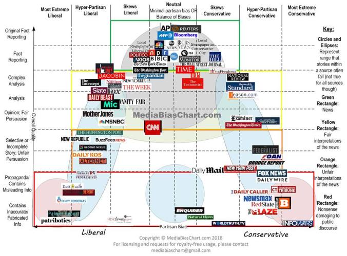
Just look at that chart, sent to me by a frequent commenter here. I wish I could make it larger on the site, but a clearer version is here.
The woman [going by only the name “Vanessa,” as far as I could discover] who created this appears to be serious: if this is satire or trolling, she fooled me. The thing is so obviously itself a product of liberal bias that it is amazing that it would be presented as otherwise. There is Fox News way over in the hyper-partisan conservative field, which is mostly fair, but lo and behold, there sit outrageously hyper-partisan CNN, The New York Times and the Washington Post mostly in the “neutral” field while ABC, CBS, NBC, NPR and TIME [KABOOM!] are sitting entirely in “neutral.”
How is it possible that someone could come to such an obviously incorrect conclusion? Several ways, actually. One is that she is far enough left that the biased and slanted hackery of sources like CNN seem moderate and fair to her. Another is that she doesn’t have a clue what bias is. A third is that she’s an idiot, and a fourth is that she’s doing propaganda for the propagandists. She has a long section on her methodology here: please read it if you are curious, and report back. I’m not going to waste my time. Any methodology that leads to the conclusion that NPR is paragon of unbiased journalism is crap by definition. I don’t need to read it to figure that out. Vanessa says we should trust her analysis because she in an English major and a patent lawyer.
Oh.
This visual representation of denial does have value: it demonstrates that there are no unbiased news sources, and that journalism is not merely untrustworthy, but actively impeding the communication of essential knowledge to the public, so they can make the informed choices crucial to a functioning democracy.
Of course, I knew that already.
(Somebody tell Vanessa.)

Methodology Part 1:0
Why I created. I will skip this part. I will note this line which is in her first section “The fact that the chart is shareable does not necessarily make it TRUE.” So perhaps she is aware of her bias. She is willing to take feedback.
Choosing the Vertical Categories
Talks about what she considers high and low quality. Says she tries to follow Society of Professional Journalists. Defines high quality as 1) a high level of detail, 2) the presence of analysis, and 3) a discussion of implications and/or complexity. So I created the categories of “Analytical” for sources that have 1) detail and 2) analysis, and “Complex” for sources that regularly have the discussions of 3) implications and/or complexity. Low quality is if she sees it as simple such as a man robbed a liquor store. She argues that low quality follow 1) sensationalism and 2) self-promotion.
Choosing the Horizontal Categories
She talks alot about how humans are humans and have bias opinions. The only thing worth noting here is this: The difference between “minimally partisan” and “skews partisan” is easily distinguishable by the intent of the organization. If they mean to be objective, that counts as minimally partisan here. If they mean to present a progressive point of view (MSNBC), or mean to present a conservative point of view (FOX News) that’s at least skewing partisan.
Choosing the News Sources to Include
What she believes is popular.
Factors for Placing the News Sources on the Chart
She uses some law jargon I don’t understand to justify this section than moves on to the following reasons.
1. Whether it exists in print
2. Whether it exists on TV, and if so, whether it existed before cable
3. Whether it exists on radio, and if so, whether it existed before satellite radio
4. Length of time established
5. Readership/Viewership
6. Reputation for a partisan point of view among other news sources: For this she using the following reason: If a large, established newspaper calls an internet website “left-wing,” or “right-wing,” and if these same internet websites call the large, established newspaper “the mainstream media,” they are in agreement as to each other’s partisan point of view.
7. Whether the source actively differentiates between opinion and reporting pieces (Does it have an opinion section).
8. Proportion of opinion pieces to reporting pieces (doesn’t really explain)
9.Proportion of world news coverage to American political coverage
10. Repetition of same news stories (why she skews CNN to sensationalism)
11. Reputation for a partisan point of view among my peers on social media
12. Party affiliation of regular contributors/interviewees
13. Presence of hyperbole in titles of articles
14. Presence of adjectives in persuasive writing
15. Quality of grammar, spelling, punctuation, capitalization, and font size
16. Presence of an ideological reference or party affiliation in the title of the publication
17. Effects of trying to actively control for my own known bias.
She list her bias here and calls herself a left-leaning moderate. She list somethings and based on what she listed I would call her moderate. However, she does not hit some of the important questions and her answers are more glossed over. She mostly says she supports civil rights and there are good and bad people in government and cooperations with most of them being good.
Factors Not Considered
advertising
Edits, Arguments, and Future Versions
looking for input.
Perhaps I will do 2.0 and 3.0 tomorrow. But read it yourself.
She puts Reuters in the “Original Fact Reporting” so I’ll start there. They’re famous for fabrications in the reporting on the middle East conflict:
https://en.wikipedia.org/wiki/Adnan_Hajj_photographs_controversy
Jack what completes this sentence, “Vanessa says we should trust her analysis because she in an English…”
How THE HELL did THAT happen? Fixed. Grrrrr.
Here is the full size photo of the chart…
You need nothing more than to read the following passage in her methodology to know that she performed a Self-Inflicted Intellectual Slap Down by puting this absurd kind of logic out there for the world to read.
The Chart, Version 1.0: Original Reasoning and Methodology
That idiotic logic is nothing but an absurd rationalization and it has absolutely nothing whatsoever to do with whether the source is biased or not. That’s only one of the many absolutely absurd nonsensical rationalizations that she uses in her methodology to make her conclusions that she puts on that ridiculous chart.
Based on what Vanessa wrote, her methodology, and her conclusions, it’s my opinion that Vanessa appears to be an idiot. Of course she could be a political hack thinking that everyone else in the world except for her is a gullible idiot that will believe her nonsense to be fact, which would make her a typical Progressive.
”Any methodology that leads to the conclusion that NPR is paragon of unbiased journalism is crap by definition.”
NPR is one of the few channels that come in at my wife’s family’s place in rural Iron County, WI (which ain’t the end of the earth, but you can see it from there) and due to the lack of an alternative, I listen in while I’m working out in the a.m.
They screen their callers pretty well, but very infrequently a Righty (I think it’s the same guy) slips through and they let him blurt out a few (IMHO) intelligible sentences before thanking him for the call and hustling him off in order to get someone else more…um…amenable to the narrative, or in their words: “Issues…that MATTER!” (cue hip drum roll)
The subject one morning was some iteration of “where are the babies” and the female guest was some clearly (to me, leastways) in-the-tank Lefty. This token Righty comes on and says something like “where was the outrage when this happened while Obama was in the WH?”
After the abrupt/expected stage hook and obligatory rote gratitude, the moderator says “you know, that’s a good question Ms. X, did this same thing take place under Obama?”
Ms. X: “Not that I’m aware of.”
If the “mid point” were bumped one dashed line to the right, this would be much closer to accurate. But even then, a large number of individual data points are misplaced.
The other problem is there are “news” groups and “analysis/commentary” groups on the same Spectrum. Daily Wire is not news. Daily Wire is commentary. Commentary should be evaluated by how rationally it approaches it’s topics in addition to pointing out it’s political flavor.
This whole chart is garbage.
Michael West wrote, “This whole chart is garbage.”
I agree.
1. It was sent to me on Facebook by a frequent commenter here.
2. The FF suggested that I would enjoy analyzing it.
3. I responded that since it concluded that CNN, ABC. CBS, NBC, the Post and the Times and NPR were “neutral,” it wasn’t worth my time, since the thing was obviously biased itself and fake research. There was nothing worthy of analysis, just mockery.
4. Whereupon the FF’s left-wing friends accused me of not being able to process legitimate research that differed from my “World View.”
5. I told them to bite me. I was tempted to tell them to fuck themselves. There is more valid research on Ethics Alarms, by far, showing just how biased CNN, ABC, CBS, NBC, the Post and the Times and NPR are, than this fraudulent hack ever examined, and those who attacked me, and, I suspect, the commenter who sent me the chart, never even looked at the so-called criteria, which screamed lunk-headedness.
6. I cannot conceive how any honest, objective person could accept this chart as anything but research malpractice.
#1 Seems like you have a few Facebook friends that also participate here.
The chart, as long as it is going to be this “extensive”, really ought to toss all the comedy shows, late night shows, and comedy channels on there somewhere halfway between center and far left and fairly low on the “reporting facts” scale.
It’s my opinion that a huge swath of the public seems to be dumbed down so badly that they can’t tell (and to damned lazy to give a shit) the difference between what’s news, what’s fake news, what’s propaganda, and what’s opinionated commentary and the unethical hacks in the media are taking full advantage of this willfully blinded ignorance. Political bias reigns supreme in the USA right now and the echo chamber that’s totally consumed by their hate seems to believe the biased propaganda submitted to be fact as long as it supports their hate. I think the chart is a decent graphical representation of this ignorance.
“The media’s the most powerful entity on earth. They have the power to make the innocent guilty and to make the guilty innocent, and that’s power. Because they control the minds of the masses.” Malcolm X
This quote from Malcolm X has taken a while for it to totally sink into the minds of western media, but the media now fully understands their power and they are wielding that power in irresponsible and unethical ways that the authors of the Constitution and the Bill of Rights could have never have imagined possible. The media has become a destructive propaganda force in the United States of America, they are abusing their Constitutional rights. The media is actively engaging in sedition (speech inciting people to rebel against the authority of a state) to inflame more anti-Trump subversion (the undermining of the power and authority of an established system).
I’ve heard people say when talking about the mind-blowing unethical shit the media is doing in today’s world saying “you just can’t make this stuff up”; wrong! The plot of the James Bond movie Tomorrow Never Dies is a nice correlation to what today’s treacherous anti-Trump media is doing. They are making tons of money selling their “journalism” and intentional partisan propaganda and outright manipulating what’s being presented to the public for the purposes of ginning up massive hate in an effort to destroy that which they disagree with.
Yes, the media is currently an enemy of the people.
Lefties are smarting at that last sentence