Asked about whether he would perform at the January 20 Inauguration or its subsequent official celebrations in Washington, D.C., country music super-star Garth Brooks said, simply, “It’s always about serving. It’s what you do.”
Right answer. This marked him as a professional, a patriot, and an adult (or perhaps as a lying hypocrite, since for whatever reason, he is not performing). The opposite reaction of so many of his show business colleagues mark them, in contrast, as divisive, arrogant, ignorant and unprofessional jerks.
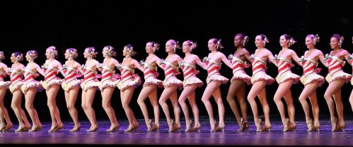
Performers fit all the requirements for being regarded and respected as professionals, who are those who use their skills and talents for the benefit of humankind and society. The traditional definition adds that professionals do this service at some personal sacrifice, a virtue that most doctors and many lawyers can no longer claim. Performers, however, are largely impoverished, devoting their lives to making people gasp, laugh, weep, cheer or most important of all, think, because they love what they do, and understand the importance of art to society and civilization.
It is as unprofessional for a singer, dancer, juggler or actor to refuse to entertain audience members whose politics or character they oppose as it is for a doctor to refuse to treat them, for a lawyer to refuse to represent them, or a clergyman to withhold from them spiritual guidance. The problem unique to performers as professionals is that they are not educated to appreciate their responsibilities like typical professionals, nor do their professions exercise any ethical oversight. As a result, we get the current display of divisive and ignorant grandstanding over performing—or not performing— at Donald Trump’s inauguration.
In Honolulu, Hawaii, yet another partisan and bigoted establishment has ordered anyone who voted for Trump to take its business elsewhere, as a local cafe posted a sign that reads: “If you voted for Trump you cannot eat here! No Nazis.” It has become clear that if many progressives have their way, their efforts to divide the nation into the Good and the Bad, with the fairly elected President of the United States as the defining feature of the latter, will shatter societal bonds coast to coast like nothing the U.S. has seen since the Civil War. The sooner the Angry Turned Vicious Left comes to its senses, the safer and healthier we all will be.
Performers, as professionals, are supposed to understand that they have a higher calling than restaurant owners. They are here to bind society together, for what we all experience in a diverse audience brings us closer in sentiment, emotion, empathy and enlightenment. For performers to decide to excise certain audience members from that process is madness, as well as a betrayal of their mission and art. Continue reading →